Organics Studio: Ralph Waldo Emerson (Twilight Blue) Ink Review
Hey fountain pen friends, it's Whitney again! Today I'm sharing a review of Organics Studio Ralph Waldo Emerson ink, or as it's also called, "Twilight Blue." I had a very similar experience with this ink as with the Organics Studio Nitrogen that I also recently reviewed. The Emerson ink has a beautiful teal line color that contrasts with its opaque and metallic boysenberry sheen. Keep reading to learn more about this very particular ink:
Supplies Used:
- Lamy AL-star with medium steel nib (also EF and B nib)
- Rhodia No. 16 dotpad, 80g white paper
- Tomoé River white paper
- Moleskine notebook
Smear Test (Dry Time):
- 30+ seconds – It takes over 30 seconds for this ink to dry. Just like the Nitrogen, I'd like to note that in areas of higher saturation, it seems that it's never truly dry; a day or two after making this review sheet, a dusting of the ink was still coming off and making smudges.
Drip Test (Water Resistance):
- Low – This ink leaves a little ghost of the original line with the addition of water, which is more than the other Organic Studios inks that we've reviewed. I'd say it still has fairly low water resistance. With water, the ink becomes a dark turquoise color.
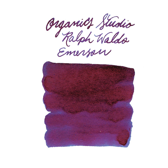
Saturation:
- High – The ink saturation on the Emerson is a bit nuts. One look at the swab shows a single thick continuous streak of that metallic sheen; you can't see anything else through that initial swab!
Ease of Cleaning:
- Low – Like the other OS ink I reviewed, it took a pretty fair amount of time and effort to get the ink flushed out of the pen. I'd be a bit afraid to leave this ink in my pen for an extended period of time.
Shading:
- Low – There's not much shading in this ink, but there's a ton of sheen. There's either teal or purple/red sheen, no in-between.
Sheening:
- High – The sheen on these Organics Studios inks is honestly kind of absurd (in a good way). With regular writing, there is a reddish-purple sheen in the bottom half of the letters. In areas of higher pooling, the sheening transforms the ink into an entirely different color, with an opaque foil-like effect. It makes for a completely different experience using one ink.
Flow:
- Wet – The flow of this ink is really wet and smooth. Like with the Nitrogen, I enjoyed that it made extra-fine nibs very smooth without being too saturated on paper (personal preference).
Packaging and Aesthetics:
- I really like the labeling and the minimal cardboard of the Organics Studios ink boxes; this one includes a portrait of Emerson, his signature, a brief bio and collection of his works, the bottle size, website, and the “twilight blue” nickname. The bottle is plastic with a simple oval label reading “O.S.Ralph” and an image of Ralph Waldo Emerson. Sarah reassuringly summed up my feelings about the bottle recently as I looked it over: “at least it's kind of centered!” This is one of the less off-kilter arrangements of print/sticker/bottle that I've seen, so I'd definitely say that the presentation of the bottle could be a bit more consistent. But hey, if the stickers on the bottles were one of the biggest setbacks to my experience, I'd say it was alright.
Inks Similar in Color :
Summary:
I continue to be cautiously optimistic with the line of Organics Studio inks. I enjoyed writing with this ink and love watching the way it produces sheen in varying degrees. I would still like to note the sometimes strange dry time and suggest being careful when using this for writing that doesn't have time to sit out a while.
You can find a 55ml bottle of Organics Studio Ralph Waldo Emerson or a 2ml sample at GouletPens.com.