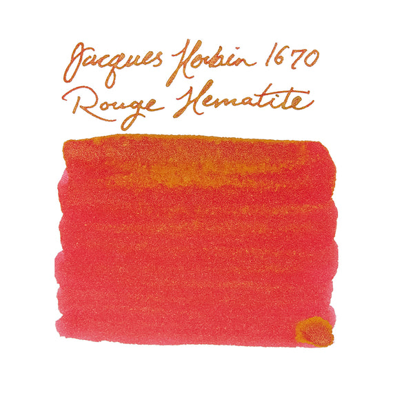
Jacques Herbin 1670 Emerald of Chivor: Ink Review

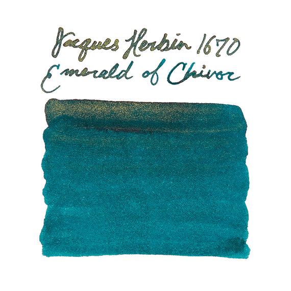
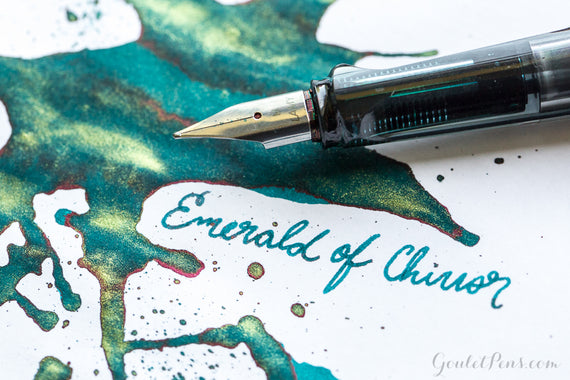
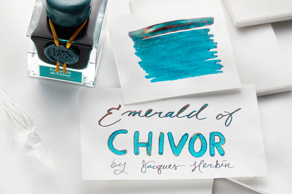
Jacques Herbin 1670 Emerald of Chivor is known for its beautiful teal color, red sheen and gold shimmering particles. Regarded as one of our most popular inks, this isn't one to miss! Read on to learn more about this beautiful ink.


Ink Review
Supplies Used:
- LAMY AL-star with medium steel nib
- Rhodia No. 16 dot pad, 80g white paper
- Tomoé River 52 gsm white paper
- Leuchtturm1917 80g notebook
Smear Test (Dry Time):
- 10-20 seconds – This ink is a bit wet writing and can smear up to just around the 20 second window. This allows the ink to pool and show off the red sheen it's known for.
Drip Test (Water Resistance):
- Low – While not water resistant you can expect some of the words and lines to hang around faintly.
Saturation:
- High – With each layer, this ink turns into a deeper blue/green, this is evident from swab one to three. Due to the ink pooling when this happens you're more likely to see the red sheen, though it can also depend on the paper and lighting.
Ease of Cleaning:
- Medium-Low – As there is shimmer this ink can be more difficult to fully clean. Even after multiple flushes the pen used will likely still have shimmer left behind that may pop up in other inks for a period of time and use.
Shading:
- High – Between the sheen and shimmer you'll see a good bit of shade variation in writing with this color.
Flow:
- Wet – We found this to be pretty wet writing which aids in the shimmer not clogging pens as easily, and showing off more of that red sheen. It flowed well in all pens we tested it with though dry times were a bit longer.
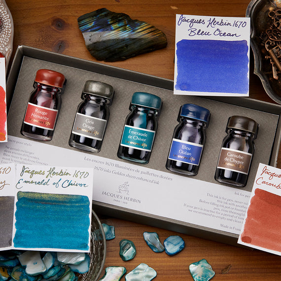
Packaging and Aesthetics:
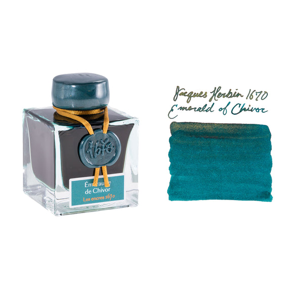
- Emerald of Chivor comes in a beautiful glass bottle adorned with a wax seal. This bottle may not be the easiest to fill your converter with, but it can be a gorgeous addition to your desk!.

If you're interested in similar colors, check out our Swab Shop where you can compare colors side by side.
Summary:
Overall, Emerald of Chivor is a stunning teal fountain pen ink that is a fan favorite of our team and customers. This is the perfect ink for jazzing up a letter or note taking and, while wet writing, this is a relatively well behaved fountain pen ink. We do suggest shaking the bottle well before filling to get as much shimmer as possible.


This color is available in 50ml bottles as well as our ink samples.